How To Create Call To Actions Users Can’t Help But Click
With every website, the goal is always to achieve a conversion, embedding subtle hints of encouragement into your design to lead your users to the contact page or checkout. But how can you make this process smooth without being too OTT in your efforts? The secret is killer call to actions, well-thought-out and evenly distributed across your site to get your user exactly where you want them to be.
Your Guide To Creating Effective Call To Actions
Whether you are designing a site for your start-up company or looking to take your existing brand to the next level, every business, regardless of scale, needs to think deeply into how they can drive users to take immediate action. This is all part of what is known as the marketing funnel, which acts as a visual representation of the journey your user takes to eventually convert. Each of the three layers of the funnel that lead to taking action – attention, interest and desire – can all be achieved with the help of effective, persuasive call to actions. So where is the best place to get started? Let’s take a closer look at the following:
- What Is A Call To Action?
- Call To Action Examples
- Best Font For Call To Actions
- Best Call To Action Words
- Including Call To Actions In Persuasive Writing
- Call To Action Marketing Ideas

What Is A Call To Action?
A call to action, also known as a CTA, is any piece of content, graphic or ad which has been designed to prompt your user to take action. This action is most commonly to convert, such as to make a sale, enquiry or booking, but can also be used to direct your user to sign up to a newsletter, for example. Ultimately, the goal is to kickstart an immediate response, giving your user an offer that they simply cannot refuse, whether this may be through your key selling points or exclusive discounts, just to name a few!
10 Call To Action Examples
When shortlisting which CTAs you want to include on your website and throughout your marketing campaign, you most definitely won’t be short for ideas. The key is always to determine which actions you want your customer to make and then begin to piece together options. In the meantime, here are some great call to action examples:
“Book An Appointment” – Vogue Nationale
With a monochromatic colour scheme, the Vogue Nationale website encapsulates all things modern luxury. When browsing their site, it couldn’t be clearer that the main area they want to drive traffic towards is their booking system. The call to action “Book An Appointment” is not only placed conveniently on their floating navigation but also after almost every piece of text on their homepage. This is an excellent example of making it as straightforward as possible for clients to schedule their booking.

“Get Started” – Future Computers
As a provider of IT services, Future Computers offers an array of solutions to businesses looking to integrate technology into their operations and streamline processes. Although their services are tailored to each client’s requirements, Future Computers have created packages that they promote via their website. Under each package option, a “Get Started” CTA has been added, which offers a friendlier method of encouraging users to get in touch.

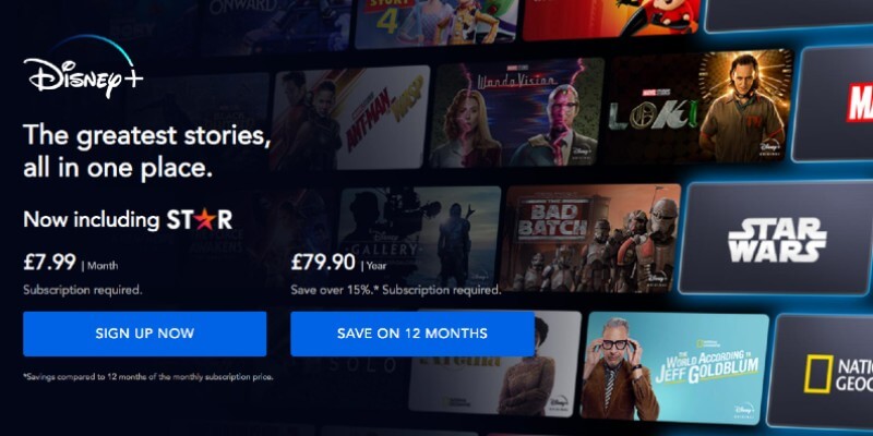
“Sign Up Now” – Disney+
From the moment that you land on the Disney+ homepage, you understand the message they are promoting. In most cases, their website users already know their next action before visiting the site – they are eager to join – and Disney+ recognises this. For this reason, they make the registration process as easy as possible by including a “Sign Up Now” call to action across the website, so the user can begin their subscription in a matter of minutes.
“Request A Call” – LasaDerm
For smaller businesses based in one location, the easiest way to manage conversions is through speaking directly with those interested in your brand, allowing you to offer a more personal approach. LasaDerm, a British cosmetic clinic, is a fantastic example of the type of CTAs you can include. Not only does “Request A Call” feature throughout the site but also call to actions to encourage users to browse their success stories.

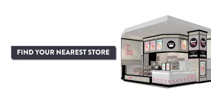
“Find Your Nearest Store” – Donut King
With more than 250 stores across Australia, it’s no surprise that one of the primary purposes of the Donut King website is to direct users to their closest spot. With this in mind, not only do they have a store locator page but also plenty of CTAs which allow users to find this page with ease. This is a key call to action for any brand with multiple locations.
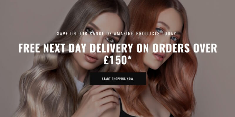
“Start Shopping Now” – Regal Envy
If, like us, you are a keen online shopper, you will understand how incentives can really make a difference to your overall experience. Hair and beauty retailer, Regal Envy have cleverly broken down their homepage content with a large CTA banner accompanied by an excellent incentive, which is a fantastic way to boost sales. This is also a great option if you want to add a break in your feed of products.
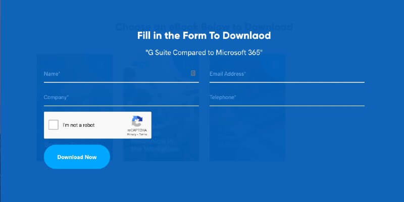
“Download Now” – ONGC Systems
As mentioned above, not all call to actions need to push users towards generating a sale or submitting an enquiry. In some cases, you may place particular trigger words on pages with specific purposes. This example from ONGC Systems is fantastic as they know users have landed on their page for resources, so they have made gaining these as straightforward as possible. Asking for email addresses in order to access additional information is also a superb method of expanding your mailing list ready for email marketing.
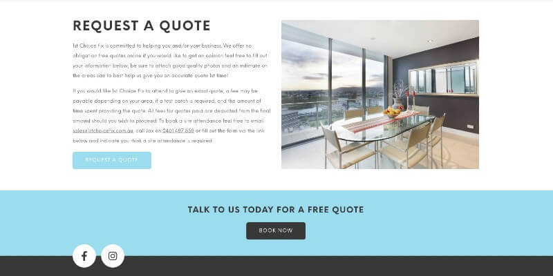
“Request A Quote” – 1st Choice Fix
In some industries, converting a user to a customer requires one-to-one communication. In this instance, the goal will be to collect as much information as possible to ensure that you are prepared when speaking with the customer. Repair and restoration specialists, 1st Choice Fix, encourage their users to show their interest by making their quotation process as quick and easy as possible, explaining what to expect when enlisting their services.
“Get In Touch Today” – Estate First Lawyers
You can never go wrong with a simple “Get In Touch Today” call to action, regardless of the industry you are in. This can not only be used as a single button but also accompanied by text that showcases your key selling points. Estate First Lawyers has integrated this across their site and accompanied it with additional CTAs for users looking to find out more information on the company before contacting them.

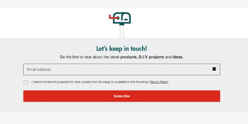
“Let’s Keep In Touch” – Bunnings
As an online store, another fantastic way of keeping your customers engaged is by inviting them to join your mailing list. Here, you can send mailshots including your latest products, exclusive discounts and loyalty schemes. This is exactly what Bunnings does, and to continually grow their mailing list, includes a newsletter sign up banner along their footer. Using the “Let’s Keep In Touch” call to action is an excellent way to take a more relaxed, chatty approach to encouraging sign-ups.
Best Font For Call To Actions
In order for a call to action to be effective, they need to be easily noticeable and cannot become lost in the remaining content. For this reason, the best font for call to actions would be those that are clean, concise and larger in size.
With our web design services, serif fonts tend to be the most popular for CTAs; however, it is important to keep in mind your brand guidelines to ensure that your chosen font fits your aesthetics. Colour will also be a significant contributing factor as the font colour and background need to contrast yet compliment. For most clients, we opt for placing call to actions in shapes, allowing them to stand out from any imagery or artwork on the page while also integrating brand colours.
Looking to refresh your website?
Get in touch with our team to find out more about our professional web design services.
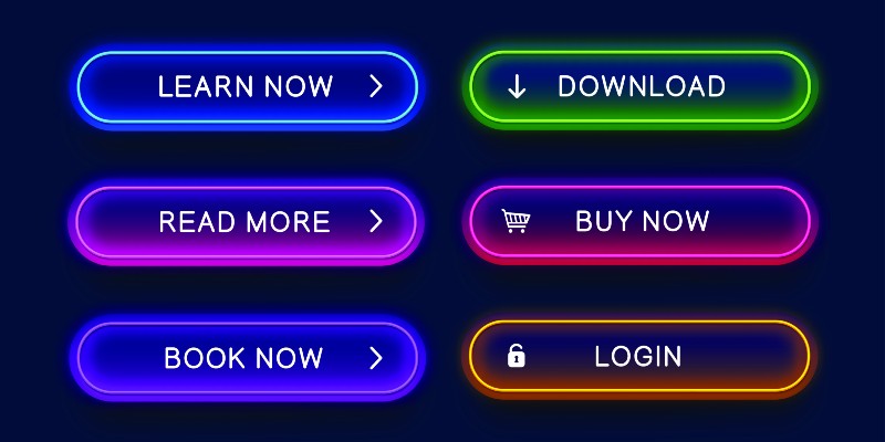
Best Call To Action Words
Although CTAs are always short, being limited in terms of how many words you can use can sometimes make the job trickier. Why? Because you only have two to three words to make an impact. The key is to choose words and phrases that trigger either emotion or enthusiasm, giving your user a reason to take the next step.
If you have space for a longer CTA, then a proven technique is to state the action that you want the user to take, along with why. For example, “contact us today to book your free consultation” shows the user that you have an offer that is too good to turn down, so curiosity will become the primary emotion – if it’s free, what have they got to lose?
With this in mind, we have put together some examples of the best call to action words:
- Generate Sale – Add To Basket, Start Shopping, Place An Order, Free Delivery, Save 50%
- Email Sign-Up – Join Today, Subscribe, Connect With Us, Stay Updated, Sign-Up Now
- Non-Profit Organisation – Get Involved, Donate Now, Support Us, How You Can Help
- Website Navigation – Find Out More, Check It Out, Learn More, Click Here, What’s Next?
- Call Or Email – Get In Touch, Get Started, Speak To Our Team, Contact Us
- User Incentive – Exclusive Discounts Available, Save Money Today, Join Our Loyalty Scheme, Free Trial
Including Call To Actions In Persuasive Writing
While, in most cases, CTAs are included in the form of easy-to-find buttons, there is no reason why you cannot integrate call to actions in your persuasive writing. In fact, as a content marketing agency, we often include simple-to-follow instructions at the end of paragraphs of text, clearly communicating how the user can invest in the brand in question.
When including call to actions in your website content, whether this may be on landing pages, blog posts or case studies, you have the freedom to explain your offerings in more depth. Content can take a more personal approach, explaining the circumstances whereby a customer may need to get in touch, how you can help them and what they can expect. Don’t forget to always add hyperlinks anywhere that you mention another service, product or trigger words such as “contact us”, again to make it easy for users to navigate your site – have you noticed that we’ve even done this throughout this article?
However, as one last tip on persuasive writing – if you are planning to include CTAs in your content, make sure you know how many is too many. Avoid adding “for more information, contact us” at the end of every section but instead include only where necessary. Look at the content from the user’s point of view and determine at which areas they would feel ready to move onto the next stage of their customer journey.

Call To Action Marketing Ideas
Now that you are well-versed on how to construct an effective call to action, we have put together some ideas on how you can successfully market your CTAs across your website:
Be Creative:
If you have a more informal, chatty tone of voice on your website, why not get creative with your CTAs? Instead of saying “take a look at our deals”, you could swap the content for “amazing deals at your fingertips!” To ensure that your CTAs are effective, you could complete A/B testing to determine whether straight-to-the-point or more creative wording works best for you.
Use Numbers:
Numbers always make your CTAs stand out on a page, whether it may be how many years of experience you have or the percentage of savings your customer can enjoy. You could also number numbers to direct users to your pricing page with CTAs such as “prices starting from just £7.99”.
Make CTAs Easy To Find:
The aim of CTAs is to make it as easy as possible for users to take action, which means that they need to be placed in clear locations across pages. On banners, under paragraphs of content and at the end of the page are key spots for your call to actions.
Keep It Relevant:
Always ensure that the wording on your CTAs relates to the page and the content. The user is reading through a specific page because they are interested in the product or service, which means that this is where they will convert. For example, on a charity website, you wouldn’t want to place a CTA to donate on the page where people can request support.
Keep in the loop with the latest industry updates!
Join our mailing list to receive helpful emails filled with expert tips and advice.
Maximise Conversions Through Call To Actions!
Understanding which call to actions encourage your user to convert will take time and testing, and if you find that they are not effective, it will only take a matter of minutes to change. Always keep your key selling points in mind, as these will be the factors that encourage your customer to choose your brand over competitors. Whether it may be exclusive discounts or streamlined booking systems, there are a wealth of different CTA ideas – now it’s time to get started on yours!
Read Articles


Stay Up-to-date
Subscribe to our newsletter mailing list today